XXXY News (New York Times API Case Study)
Adobe Illustrator (mockups)
d3.js, nvd3, JavaScript, Vue, Vue Router, Node.js, php, es2015, Webpack (laravel-mix) SPA
Node.js, API
My Role in This Project
Position:
Project/Research Lead, Design & Engineering
Design:
Data Visualization, Information Architecture, User Interface Design, User Experience
Data:
Processing and Cleaning: PHP, Node.js / Data from NYT API
Analysis:
Sentiment Analysis
Engineering:
Front-end: D3.js, nvd3, Vue, Vue Router, JavaScript, HTML5, SASS
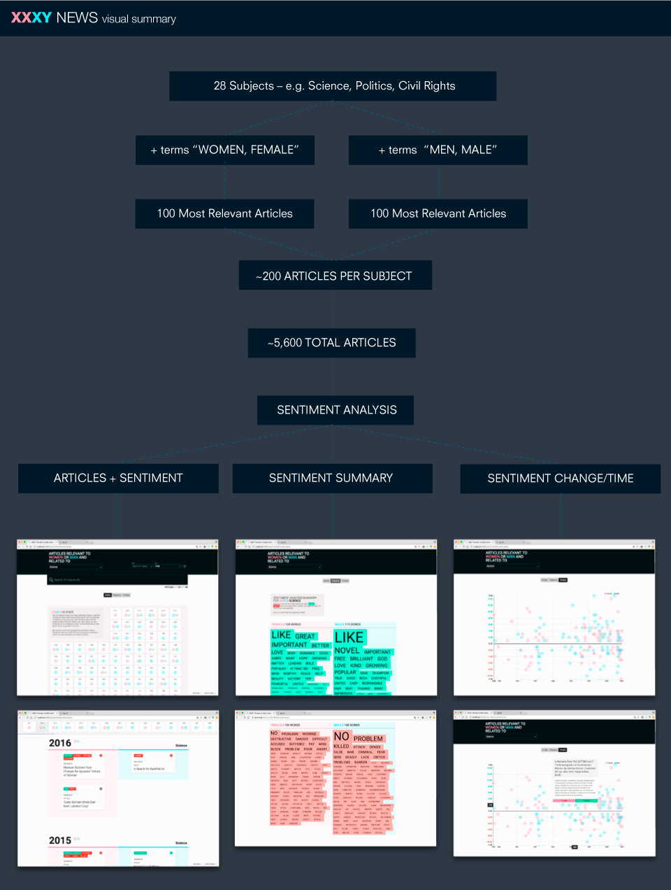
XXXY (triple X, Y) News is an experimental, proof of concept application designed to augment news articles with attributes that can aid our understanding of the news, provide context, and ability to ingest larger amounts of information. In its foundation, lays the hypothesis that articles related to women’s vs men’s issues differ, as issues pertaining to the two differ, and it aims to allow us to study them by providing a split view of the news – one that searches for articles containing the words “women, female” and another containing the search words “men, male”.
Data Collection & Analysis Methodology
XXXY queries the New York Times Articles Search API for articles with query terms “women, female” and then separately with query terms “men, male.” This results in the default application view before selecting a specific topic. The API searches the article’s body, headline and byline and returns the relevant results. I then expand on the search and ask for the first 100 articles for each sex, sorted by relevance, on 27 topics such as science, religion or technology. For example a query search for science looks like “women, female, science” and “men, male, science.”
Articles View – Summary, Small Multiples
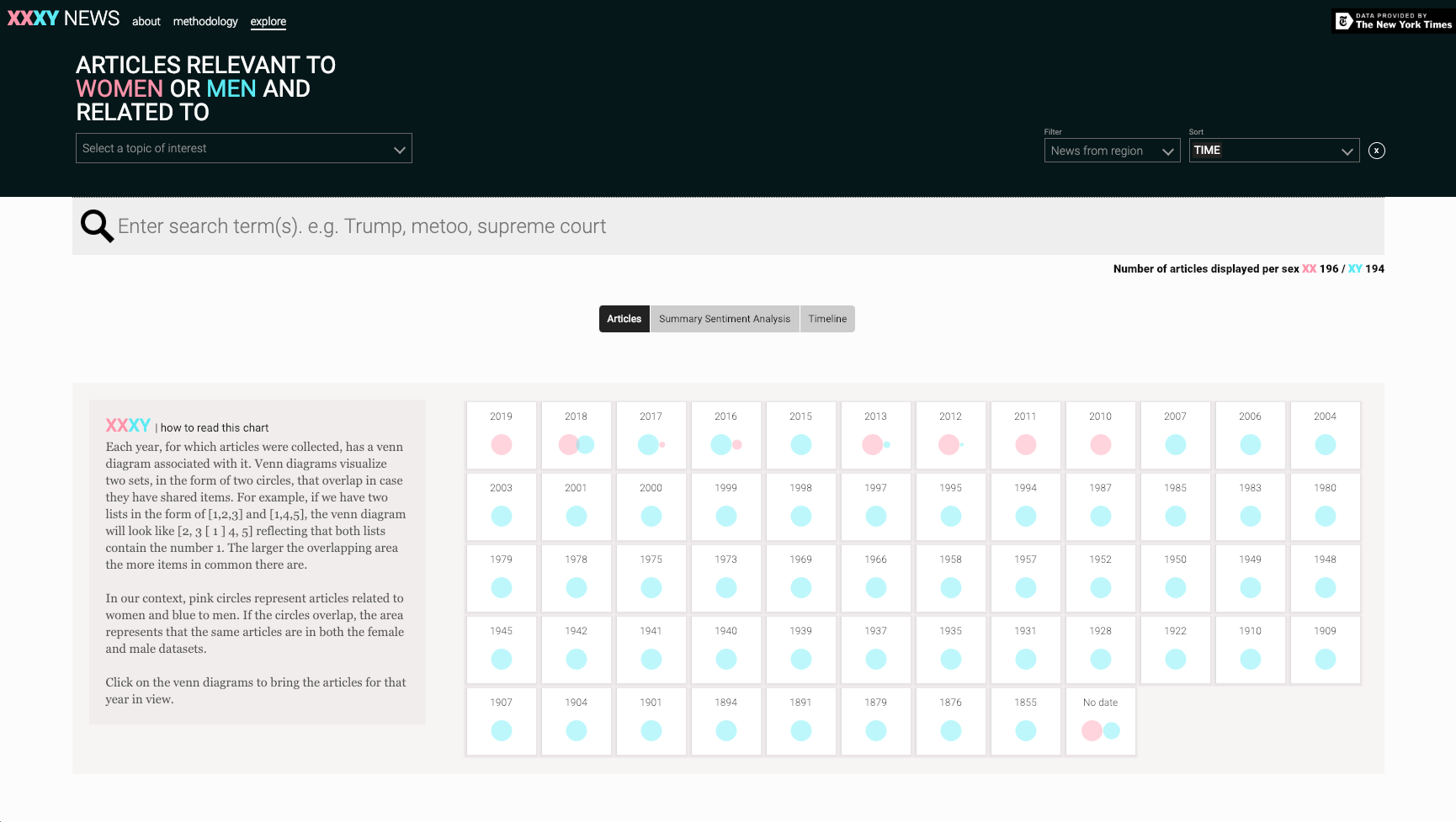
The first thing users see, after familiarizing with the methodology and about pages, is a small multiples visualization (venn diagrams) summarizing the number and type of articles in the set per year.
Articles View – Calendar
Underneath is a calendar view of the articles. The left side shows articles from the female search, and the right one from the male search.
Articles View – Navigation
There is a significant challenge in creating a good and valid user experience for very long pages. The solution I propose is to create a visual summary navigation, containing clues what the page contains across its height, and keep it persistent.
Here, to make the movement among different years seamless, the summary visualization is being restructured, repurposed, and reused as a navigation bar. The moment users scroll down to the calendar, it is appended at the top and moves up and down as the users scrolls. This, in effect, allows users to navigate thousands of pixels with a simple move within the nav bar at the top. Further, it uses the already learnt visual language from the summary visualization, doubling the benefit from the initial investment of time spent learning how to read it. Finally, it also keeps the context persistent for users from the moment they land on the page and throughout the user journey.
Articles View – Sentiment and Context
The application applies sentiment analysis to each of the article's components, extracts the classified words, color codes them at the top, and shows the sentiment score. Each article can be expanded on hover to read a snippet. Sentiment words can be hovered and quickly found within the text. This is highly beneficial in enabling us to parse through vast amounts of qualitative data faster, however it has its downsides – the methodology page within the application thoroughly explains the caveats of the applied analysis.
Articles + Topics
Users can select among 27 topics and keywords such as politics / president / science / religion / civil rights / lgbt. The choice of keywords to search for was driven both by current events and common curiosity. In addition, keywords such as feminism, children, sports or family were selected because they have female or male leaning associations.
Gender + Politics
Upon selection, the interface transitions to reflect the selected topic/keyword.
Search
The interface allows users to search for specific keywords – it updates in real time.
Search – Trump
Both the articles and summary view are filtered in real time, allowing users to save time and also discover interesting patterns.
Sentiment Analysis Summary
All the classified words from the sentiment analysis are extracted, sorted within each group, and visualized proportionately to the number of times used. Remaining consistent, all words pertaining to the female set are on the left and the male set on the right.
Sentiment Analysis Summary – Comparison
Hovering over a word in one of the sets highlights it in the other.
Sentiment Analysis Summary – Comparison
Clicking on a classified word brings up all the articles that contain it, providing a data driven filtering mechanism of the entire set of articles, surfacing connections that are otherwise hidden or unintelligible.
Sentiment Analysis Change Over Time + Time + Gender
Plotting the sentiment analysis shows us if there is any relationship between time and sentiment. Each article is represented by a circle – pink for female, blue for male. The further under the black line or 0 (neutral sentiment) a circle is, the more negative the sentiment and vice versa.
Article
Hovering over the circles brings up the articles titles and snippets.