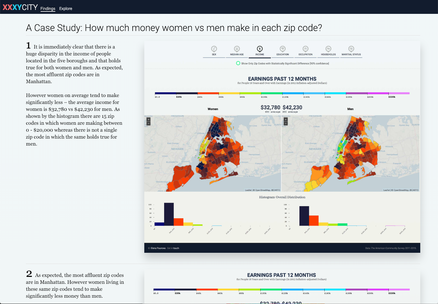
XXXY City (New York City Edition)
Adobe Illustrator (iconography)
d3.js, Leaflet, JavaScript, Vue, Vue Router, Node.js, es2015, Webpack (laravel-mix) SPA
Node.js, API
My Role in This Project
Position:
Project/Research Lead, Design & Engineering
Design:
Data Visualization, Information Architecture, User Interface Design, User Experience, Mapping
Data:
Processing and Cleaning: Node.js / Data from Census API
Analysis:
Statistical Significance
Engineering:
Front-end: D3.js, Leaflet, Vue, Vue Router, JavaScript, HTML5, SASS
XXXY City (Triple X, Y) is a data visualization project analyzing the difference between women and men in New York City on seven factors – education, occupation, income, age, sex distribution, housing arrangements, and marital status.
The visualization is built on the premise that by comparing zip codes, we can evaluate existing assumptions we hold about New York City as well as discover new patterns. We can find clusters of affluence and poverty; the least and most educated; where professionals in specific fields (from computer scientists to law enforcement) tend to live; how many people are single and how many are married and where they live, etc. We can correlate outcomes such as income, education or housing arrangements with geographic location and sex.
Further, there are multiple conversations surrounding equality that intensified in the last decade. By isolating the male vs female outcomes we can improve our understanding of how the two sexes experience the city; confirm or refute hypotheses such as income inequality and the underrepresentation of women in STEM (Science, Technology, Engineering, and Mathematics).
Finally, we can use this visualization method to expand our knowledge of the city and analytically isolate populations of interests – whether you want to use it to support populations in need or to purely connect with and learn more about your fellow humans. All of the findings are supported by the ability to isolate zip codes with a statistically significant difference (90% confidence interval), accounting for the margins of error in the data, further enhancing our ability to draw meaningful conclusions.
The 7 Indicators & Icons set

Findings
Did you know that the population of Roosevelt Island is the most highly educated in the city? This and other findings that unserfaced from the project are outlined on the findings page together with a detailed case study on gender and income.
Explore
The explore mode allows users to navigate among 48 different maps across the seven indicators.
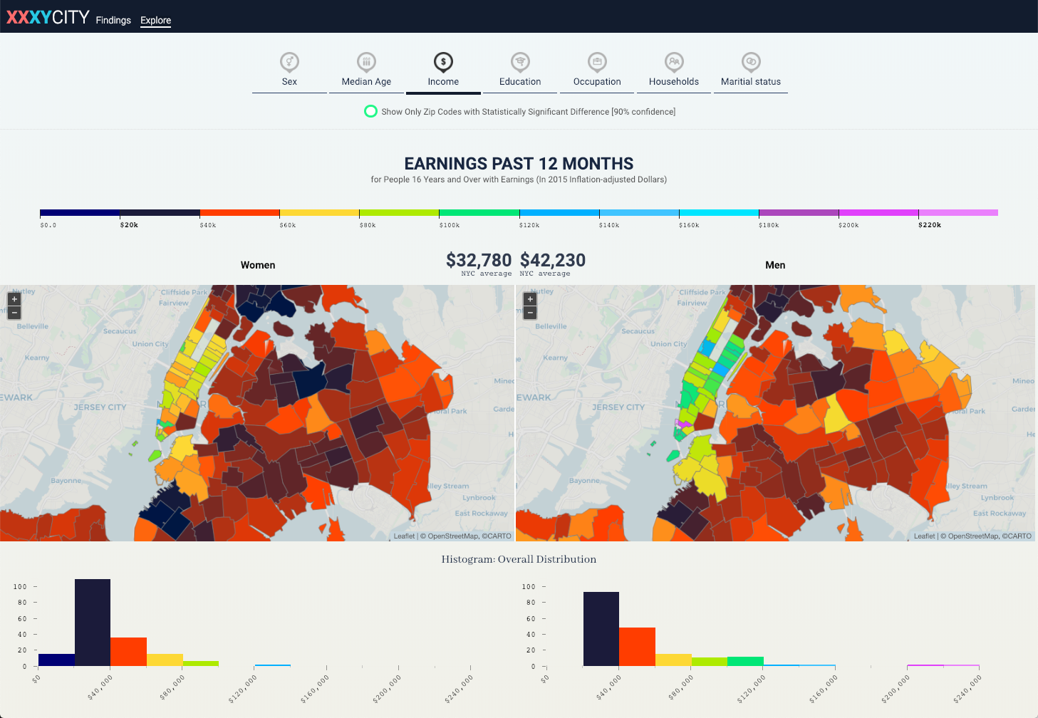
Synchronized View
The women and men map are synchronized – you zoom in/out/pan one, the other zooms in automatically to match the view you are manipulating.
Tooltip
A comprehensive tooltip, visualizes the distance between the male vs female indicators, in this example – income. The numbers are clearly shown, the difference color coded and calculated, and where applicable share (%) is calculated. A green YES or red NO are used to clearly and simply communicate whether the difference is statistically significant at the 90% confidence interval. Once again, it does not matter whether one will navigate by the female or male map – the information for both is visible .
Histogram
The histogram reflects the number of zip codes in each bracket and provides a quantitative comparison through the bars.
Statistical Significance
Activating the statistical significance filter animates the map by filtering out the zip codes in which the difference is not statistically significant. It is also recalculating the distribution histogram and the legend by redistributing the brackets to provide the most optimal level of detail. The statistically significant zip codes are then available for further inquiry.
Sub categories
Five of the seven indicators allow users to drill down to further detail.
Example sub categories
The sub categories can be quickly accessed by the previous | next navigation under the indicator or via the main menu.
Example sub categories – tooltip
The tooltip changes the type of data it shows based on what is most user friendly – in the case of education the primary unit is % as it is much easier to make comparisons. The exact number of people are shown under, so users can still get a sense of the size of the population the percentage is calculated from.
Detailed breakdown
Clicking on each zip code brings up a detailed panel, showing all data available for the zip code, across the seven indicators, allowing users to look for correlations.
Detailed breakdown – interactions
Users can hover over each category to reveal additional information.
Detailed breakdown – interactions
Finally, the ability to expand the entire chart was added, to facilitate analysis and comparison among sub categories. The entire user interface is driven by users’ ability to choose how much detail they want to see depending on what brings them to the visualization. The default views provide ample detail for curious laypeople and users, whereas the detailed views can aid researchers and stakeholders in drawing analytical conclusions.