UNICEF Open Data
Adobe Illustrator
d3.js, JavaScript, SASS
API
My Role in This Project
Position:
Project Lead, Lead Design & Support Engineer
Design:
Data Visualization, Information Architecture, User Interface Design, User Experience
Data:
Processing and Cleaning: Excel, JavaScript
Engineering:
Front-end: D3.js, JavaScript, HTML5, SASS
In 2014, UNICEF needed to create an open data portal, contributing to the International Aid Transparency Initiative (IATI). While at Seed, I was tasked with leading the project (information architecture, user interface design, data visualization, and support engineering). The Seed team worked closely with a team of 6-8 people from UNICEF on the design and implementation of three data driven views that best represent the flow of money between donors, recipients, and initiatives. In 2016, the AID Transparency Index placed UNCIEF in the top “very good” category, at position 3, for meeting the aid transparency requirements.
Intellectual Property: this project was created while I was working at Seed and all intellectual property belongs to its respective owners as negotiated by contractual agreements or by law between the client and the company. Used with permission.
The screenshots were taken in 2015 and the information on them should be considered outdated and purely demonstrating the general concept and visualization methods. For accurate reports visit the current version of open.unicef.org.
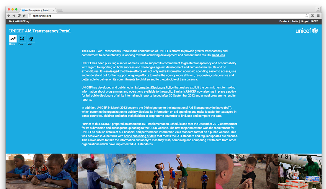
Summary page.
The landing summary page shows the overall amount of money received from partners and the distribution of funds. We created three categories that easily communicated the flow of money – Where the money comes from, Where the money goes, and What the money is spent on.
Summary detailed breakdown.
Each category shows the first ten donors, recipients or initiatives respectively, with the ability to expand and see the complete lists. We added a small bar chart to indicate visually the amounts of money spent or received.
Map View.
There was a hard requirement that one of the visualizations is that of a map with a table. Given the massive amounts of information in the database, we needed to find an intuitive way of navigating it – filtering and sorting were crucial. The table was further enhanced by embeddeding small multiples to reflect the three categories – planned Disbursement, Commitment, and Expense and make parsing the data visually much faster.
The Architecture.
We created an information architecture that grouped the data in hierarchical buckets, allowing us to show one kind of data at a time. We started from the country as the most intuitive way of beginning the user journey and added ability for users to drill down to the level of detail they are interested in.
The navigation.
Simplifying the user’s navigational choices in projects of that level of complexity is fundamental to the user experience. With that in mind, we embedded all controls in a sentence providing context for users when making filtering choices.
Tabulation.
The data was codified as overview – showing commitment, expense, and planned disbursement, funds available – showing commitment, and spent – showing expense. The color coding was preserved throughout to establish visual connections between the different views.
The sentence navigation.
Each dropdown is searchable, and the data is grouped into clearly labeled categories to enable both stakeholders to quickly get to data points of interest and laypeople to understand the UNICEF framework.
Dynamic.
The sentence changed based the other selections made on the screen.
Flow.
For the third visualization, we worked very closely with the UNICEF team to unpack how we can best present the three relationships – money in, money out, and spent on, in a single visualization. We settled on a diagram that codifies the money flow both relationally and proportionately. Behind each bar and line on the sankey diagram, are hidden comprehensive lists and labels, showing all data points. At the end, the information architecture we created, enabled us to show everything and account for every dollar, while still maintaining a relative simplicity, by serving the data at the point of interest only.
Labeling.
We embedded each donor, the donated amount, and visual representation for proportional comparison, into a list accessible on click of each category in the hierarchy.
Labeling.
The lines connecting the nodes are also labeled and highlighted on hover – a feature especially important for thinner lines.
Sectors.
Hovering on each sector shows the amount spent on it.
Filter.
For consistency, the sentence at the top embeds the filters. Changing the year, animates the diagram and shuffles the categories as needed.